Bold Move! Statement contrast do's and don’ts
Bold interiors, full of colour and contrast, have returned to centre stage. In a sharp shift from the neutral tones we have become used to, there’s an uptake of the vivid in a kaleidoscope of the eclectic that sees pattern on pattern reign and the juxtaposition of opposites demand you take notice.
But does it always work? Possibly not. While we love many of the elements at play in these interiors, there’s a fine balance between statement contrast for its own sake and the more artful intrigue created through unexpected ensembles. The difference for us can be measured through an immediate curiosity - an emotional response where we feel inspired, begin to covet new pieces or seek to replicate these design ideas in our own spaces. Instead, we often feel overwhelmed and emotionally indifferent prompting us to ask, what (for us) are the dos and don’t of styling competing design elements?
Do: use block colouring.
Colour can be many things. It can conjure mood and experience, travel and nature. As a tool of design, it has extraordinary breadth and is able to sooth or stimulate and elicit an emotional response. When applied to large or contained areas, it can give a space a sense of identity - where earthy terracotta tones have us dreaming of sun- drenched Tuscan interiors just as oceanic, aquatic blues can breathe calm into bedrooms, living spaces and drawing rooms. In the same way, darker tones can help shape larger open areas, whereas warm tones lift and give levity to small spaces and shadowed enclaves. Using colour at scale or in the confines of defined boundaries often works beautifully but does come with a caveat…

A beautifully tranquil but luminous living area via @lucywilliamshome
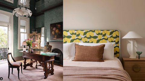
Left: Colour can help shape larger, open areas via @tamsinjohnson. Right: Colour and pattern make a bold beadhead we can’t help but love via@arentpykestudio
Don’t: make it muddy.
Too much colour is overwhelming and focus is lost when a different colour is used on every wall or clashes, overwhelmingly, with other dominant colours used throughout an interior. Let the eye roam but also let it rest with areas of calm neutrals or classic white.
Do: use pattern on pattern.
We love pattern on pattern for it demands design mastery and immediately injects dimension into any interior. From textured wood to wallpaper or a swathe of soft furnishing in different prints , pattern on pattern both dissects and connects space, depending on its intention. When done well, this device of design does not feel out of place but rather intuitive and essential to the quality and character of a layered and elevated interior.

Pattern on pattern, done to perfection in a @kellywearstler interior.

Plush soft furnishing creates a layered and elevated interior. Via @downtownlaproper

When done well, pattern - through for, print and texture - connects and dissects space, depending on intention. Left via @downtownlaproper, Right via @luislaplace.
Don’t: create visual unease.
Over energising patterns can be disorienting and overstimulating without areas of block colour or visual restraint. Avoid covering every surface and balance through a complimentary palette, finding common ground through tonality within patterns that compete.
Do: balance masculine against feminine elements.
As classic complementary opposites, masculine and feminine elements balance an interior by saving it from the banality of being one dimensional and/or completely uniform. It’s the soft curve against angular edges or coloured grain through moody stone.
How and where we infuse these, however, can break the mould of tradition to breathe life into our interiors in new, bold and inventive ways. Perhaps, in part, it is a larger reclamation of gender, its fluidity and intersection. After all, the demi-lune arc and earthy palette of a David Flack powder room (below, right) feels as richly masculine as the cognac tones of a sculptured Caleb Woodard cabinet does feminine (below, left).

The perfect balance of masculine and feminine: Left: via@calebwoodardfurniture, Right: via @flackstudio_
Don’t: default to stereotypes.
The best contrast is unexpected and is neither derived nor gaudy. Opt for an independent perspective where colour, form and texture feel balanced but contemporary.
FROM THE INVENTORY

The Safari Chair, SHOP NOW
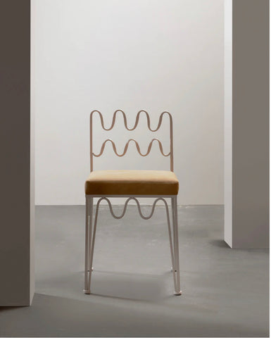
The Wave Chair, Ivory. Shop Now

The Phoenix Console, SHOP NOW

The Wave Fire Screen, SHOP NOW