Sun-Saturated: the post-pandemic style shift that's here to stay
Post-pandemic, we’ve all changed. For some, it may feel subtle but collectively, there is an obvious and monumental shift in our psyches that has found visual expression in the creative domains - in art, fashion and interiors. It’s a turn towards the sun, to saturated hues and the warmth and optimism of colour that even the most neutral-loving amongst us, finds themselves craving as an antidote, perhaps, to all those years in lockdown.
While all things have their season, we strongly believe that colour is here to stay (and reign) and from watermelon tones to golden ochres, peach and lemon, we look at 3 ways to fall in love with a stronger, richer palette and how to weave it into your homes.

Left: St Tropez Hotel, La Hotel Tartane and Right: a bedroom designed by Phoebe Nicol Interiors via@phoebenicol.interiors.
1. Paint and Palette
Because paint is impermanent, it offers a great opportunity to introduce colour. There is also enormous breadth when it comes to strength and saturation so that trial and error can be accommodated in the search for the perfect palette. As tone informs mood and is affected by light, finding the colour you most respond to may not be immediate but rather, take a few test patches. Take your time with this part of the process and if you are stuck, seek inspiration from others or speak to a paint colour specialist.
We love: earthy pinks and European summer tones - colours that conjure summer travel, terracotta, coloured marble and the late afternoon of a sun-drenched landscape.

Left and Right: earth pinks add warmth and texture to a bedroom wall and walk in robe via @70shousereno

Saturated hues add warmth and optimism. Left: a Sicilian residence styled by interior designer Marie Olsson Nylander, @marieolssonnylander and right, another room of La Hotel Tartane with its uptake of sun-soaked palette.
2. Soft furnishing
The fabric of upholstery and soft furnishing - that of curtains, cushions and carpeting - naturally lend themselves to colour. Rather than dominate, they accent, drawing out elements in art, landscape and their surroundings to feature, offset or emphasise. Through their texture, they also layer both richness and levity as can be seen with ochre-rich velvets vs patterned linens or peachy canvassing.
We love: Dusty pinks, lemon yellow and peachy tones for both indoor and outdoor seating as well as the sumptuousness of velvet and pattern on pattern in linen bedding and cushioning.

Left: Peach perfection @raesonwategos via@melcarrero_, Right: Perfect dusky pinks on .display via @intheroundhouse

Rather than dominate, colour in soft furnishing accents - drawing out elements in art, landscape and their surroundings to feature, offset or emphasise. Left: via @pheobenicol.interiors, Right: via: @reallivingmag

Pink carpet and patterned linen love. Left via@phoebenicol.interors and right, Kip and Co x Rachel Donath @racheldonath
3. Tableware and napery
The tide has most definitely turned when it comes to embracing colour in tableware. From tinted glass to painterly plates, patterned tablecloths and napery, the table has become a landscape of texture and an almost kaleidoscopic collision of colour - a feast for the eyes that fosters abundance and the reverie of an endless summer.
We love: Summer tinted glassware, painterly plates, colourful scalloped napery and the rich prints (and pattern!) of tablecloths.

A kaleidoscope of colour with tinted glassware via Maison Balzac.

Left: a table layered with colour and texture becomes a feast for the eyes. Left: via@bedthread and right, via@intheroundhouse

Painterly plates, patterned tablecloths and napery done to perfection via @kipandco.
From the Inventory
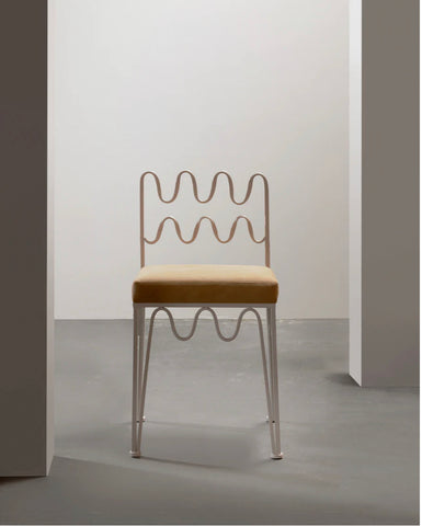
The Wave Chair, Ivory. Shop Now

A French Trumeau Mirror, 1870s. Shop Now

The Phoenix Marble Console. Shop Now

The Wave Coffee Table, Ivory. Shop Now
Rachel Donath is a purveyor of designer and antique furniture, Australia.
Discover The Inventory here.